Measuring Data Health: A Full Guide

Data health scores help you measure and track the quality of your data—this guide explains how they work and how to implement them.

Data health is a critical yet often misunderstood concept for modern data teams. Measuring it effectively ensures you can answer key questions like, Can I trust this dataset? Do we have sufficient test coverage? Are we making progress in improving data quality? This guide dives into the why, what, and how of data health measurement and demonstrates how Elementary leverages data health scores to elevate data observability.


We also recommend watching the 'Measuring Data Health' webinar recording.

Why Measure Data Health?

Every data team faces scenarios where trust in data is questioned. Imagine presenting stakeholders with assurances of data quality, only to face their skepticism due to recurring discrepancies or delays. Now imagine starting that same conversation with hard metrics: “Our marketing dataset’s quality score has improved from 90% to 95% this month.” Data health scores bring a data-driven approach to discussions about quality, fostering transparency and trust.

For practitioners, data health scores transform vague test results into actionable insights. Instead of just reporting failed tests, engineers can say, "Our marketing dataset has a completeness score of 92%. It’s reliable despite minor null values.” This structured, quantitative perspective fosters better collaboration and prioritization.
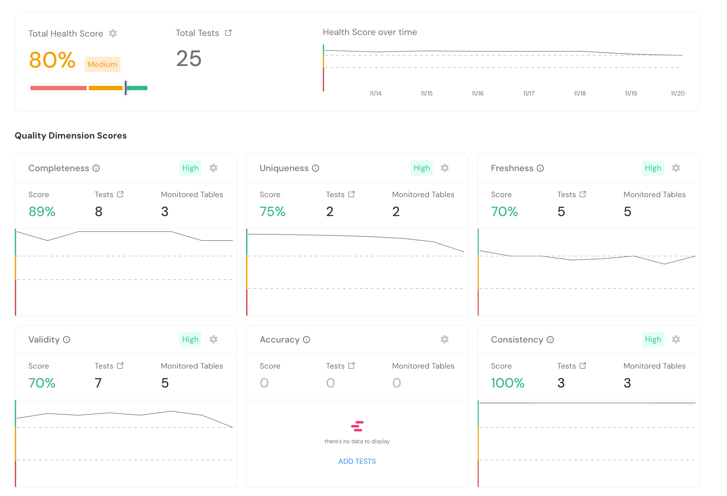
Dashboard displaying a health score of 80%, total tests 25, with score trend over time. Quality dimension scores: Completeness 89%, Uniqueness 75%, Freshness 70%, Validity 70%, Accuracy no data, Consistency 100%. Graphs and score details included.

Lessons from the Community

Elementary’s approach to data health evolved from conversations with our community. Early in 2023, users began requesting tags like completeness and freshness for quality validation. As we explored this, it became clear that many teams were independently categorizing their data tests into broader dimensions of quality.

This aligned with the Quality Dimensions Framework, an industry standard that organizes data quality into six common dimensions:

Source: https://www.getdbt.com/blog/data-quality-dimensions
  • Accuracy: Does the data align with real-world facts or business rules?
  • Validity: Does the data conform to expected formats and ranges?
  • Uniqueness: Are there duplicates?
  • Completeness: Are all required fields populated?
  • Consistency: Is the data uniform across datasets and sources?
  • Freshness: Is the data up to date?

By categorizing data tests into these dimensions, teams gain granular insights into where their quality efforts are succeeding—or falling short.

Examples of Quality Dimensions in Action

To illustrate, let’s use the example of IMDb datasets:

  1. Freshness: If IMDb’s rating for The Godfather hasn’t been updated since 2000, it misrepresents current sentiment.
  2. Completeness: Missing a key cast member like Uma Thurman in Pulp Fiction diminishes the dataset’s usefulness.
  3. Uniqueness: Duplicate records for The Matrix with different release years create downstream inconsistencies.
  4. Consistency: If IMDb’s “Top 250 Movies” list shows 254 entries, users lose trust in its accuracy.
  5. Validity: A movie runtime listed as 1,500 minutes (when the longest movie ever made is 873 minutes) would be invalid.
  6. Accuracy: Listing Leonardo DiCaprio as the director of Inception instead of Christopher Nolan reflects a factual inaccuracy.

Each dimension addresses a distinct aspect of data health, allowing for targeted validation and monitoring.

Calculating Data Health Scores

There are multiple ways to calculate quality dimension scores. Here are two simple methods:

Based on Test Fail Rate

Each test receives a score based on its status:

  • Passed: 1
  • Warning: 0.5
  • Failed: 0

Example: If four tests are run (three passed, one warning), the dimension score would be:

(3×1)+(1×0.5)+(0x0)÷ 4 = 87.5%
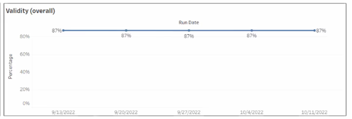
Line graph titled Validity (overall) showing consistent data at 87% on 9/13/2022, 9/20/2022, 9/27/2022, 10/4/2022, and 10/11/2022. Y-axis represents percentage, and X-axis represents run dates.

Based on Failed Row-Count

This approach calculates scores based on the proportion of rows affected by failed tests:

Test Score → (total row count - failed row count) / total row count

Quality dimension score → avg. (test score for each test in this dimension)

Example:  If 4 tests are run- 3 passed with 1000 rows and 0 failed row count each, 1 test failed with 100 failed rows out of 1000 rows in the table.

  • The score for a successful test would be -->  (total row count - failed row count) / total row count --> (1000 - 0) / 1000 = 1
  • The score for the failed test would be --> (total row count - failed row count) / total row count --> (1000 - 100) / 1000 = 0.9
  • The quality dimension score would be --> avg. (test score for each test in this dimension) --> (3 * 1 + 1 * 0.9) / 4 = 0.975
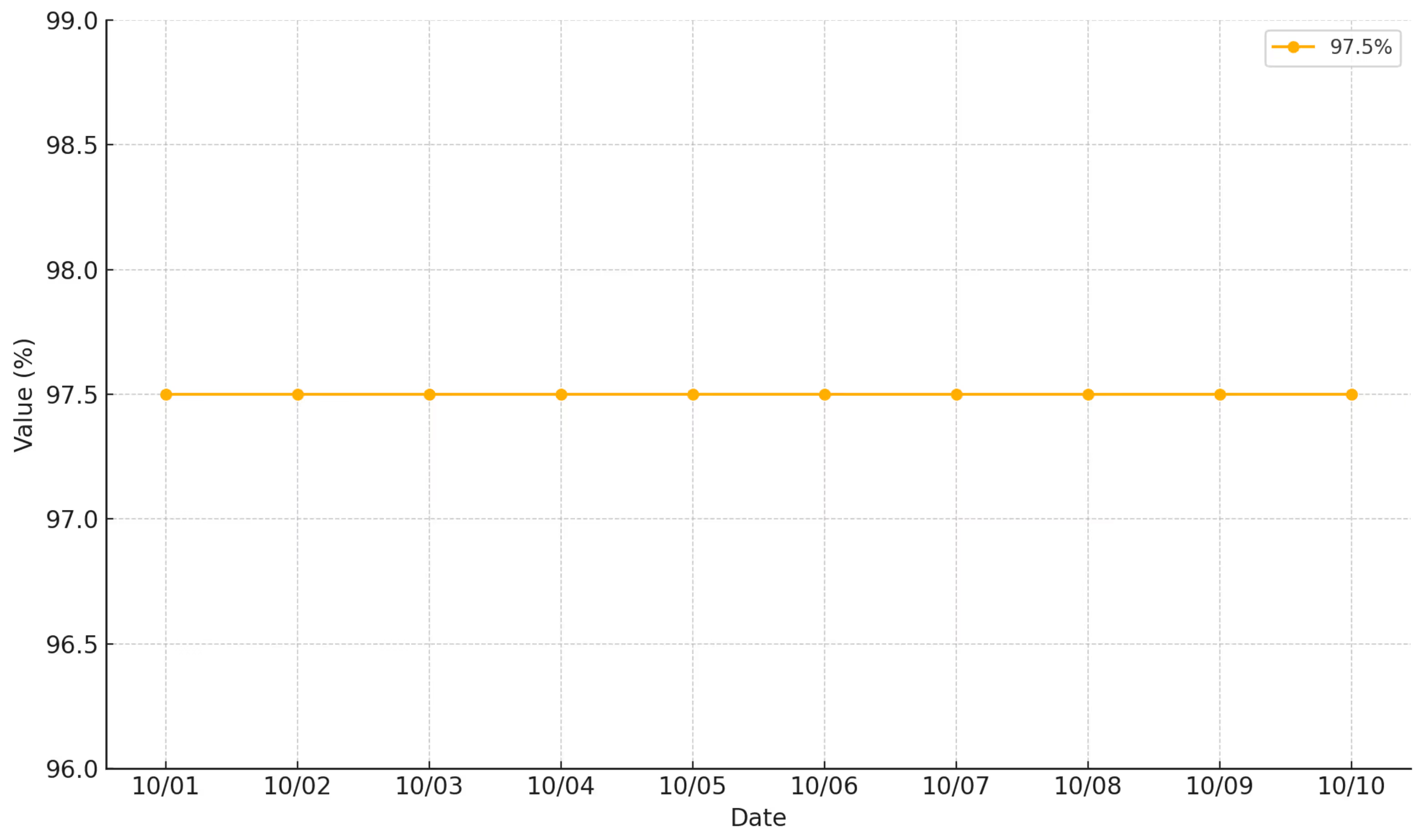
Line chart displaying a consistent value of 97.5% from October 1 to October 10. The x-axis represents dates and the y-axis represents percentage values. The line is orange with data points marked each day.

Both methods allow teams to aggregate scores by dimension or dataset, providing a clear picture of overall data health and trends over time.

Challenges in the dbt Ecosystem

Implementing health scores within the dbt ecosystem presents unique challenges:

Test Mapping

The sheer variety of dbt tests, spanning multiple packages (e.g., dbt expectations, dbt utils), makes mapping them to quality dimensions complex and time-consuming. To help streamline this process, we created the dbt Test Hub. The hub offers curated documentation, practical use cases, and organizational tips to navigate the diverse landscape of dbt tests. While it simplifies some aspects, the diversity of tests still poses challenges for consistent measurement.

Screenshot of a website for dbt tests. The page lists various dbt tests with three search filters: general keyword search, use-case and package.

Aggregated Test Results

dbt tests often return aggregated results, making it hard to calculate the row-level impact of failures.

Calculating Data Health Scores from dbt Tests

Elementary automatically calculates quality dimension scores for dbt tests while addressing these two primary challenges: mapping tests to quality dimensions and handling disaggregated test results. Here’s how it works:

Mapping Tests to Quality Dimensions

Elementary performs the tedious work of mapping commonly used dbt tests (native tests, dbt expectations, dbt utils) to default quality dimensions. This allows for a structured approach to evaluating data health. Here is an example of how Elementary mapped these common tests into their relevant dimensions:

  • Accuracy: Validated using tests like accepted_values and expression_is_true.
  • Completeness: Evaluated with not_null and not_null_proportion tests.
  • Consistency: Assessed using relationship tests.
  • Uniqueness: Measured via unique and unique_combination_of_columns tests.
  • Freshness: Determined using dbt source freshness or recency tests.
  • Validity: Verified with tests like expect_column_values_to_be_of_type.

Additionally, Elementary enables users to configure or override these mappings dynamically. For example:

Custom SQL (singular) tests can have their quality dimensions assigned using a meta field, ensuring flexibility and adaptability for unique project requirements.
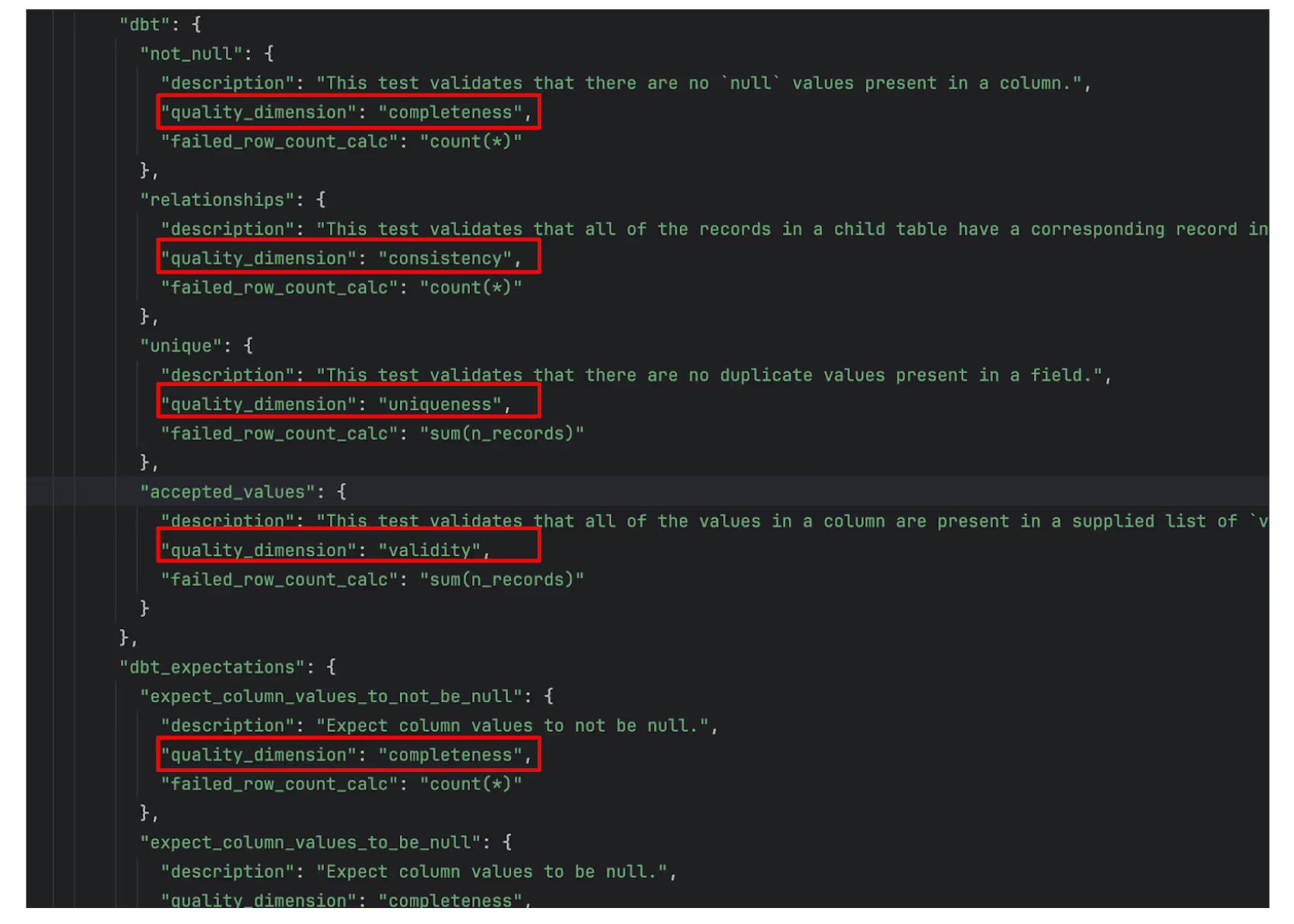
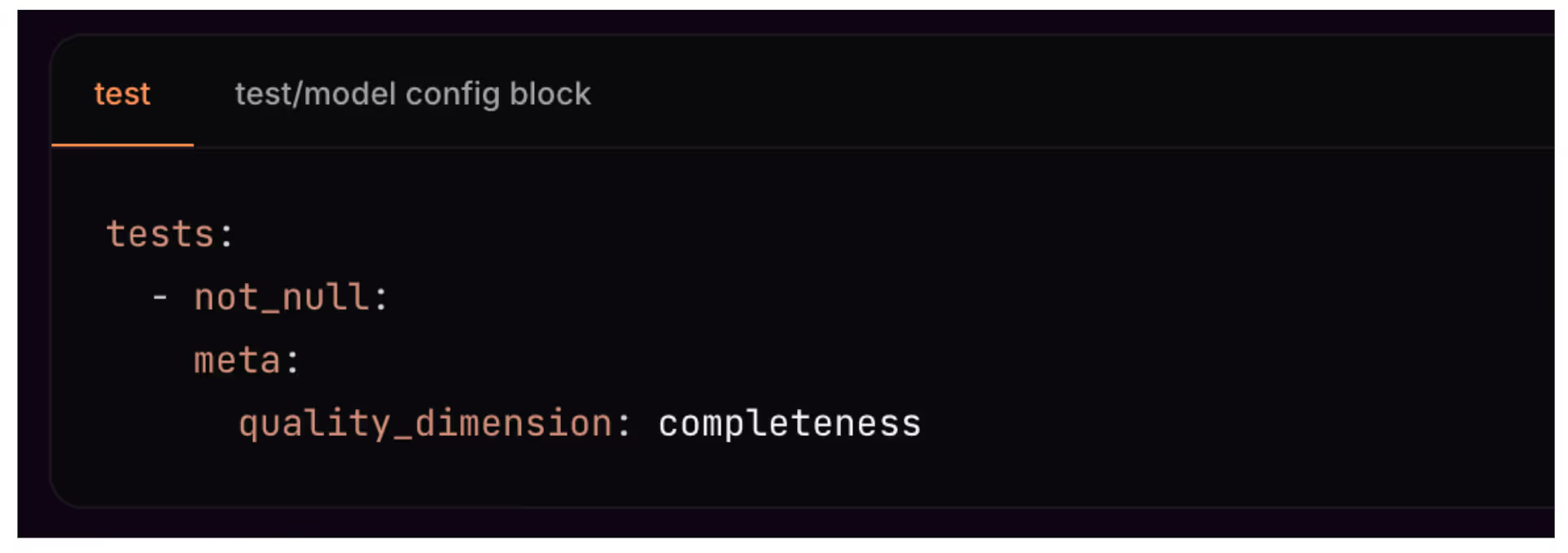
Screenshot of code with highlighted sections focusing on quality_dimension values such as completeness, consistency, uniqueness, and validity.
A code snippet showing a test configuration block for data verification. It specifies a not_null test with metadata indicating the quality dimension is completeness.

Capturing Accurate Test Results

dbt test outputs are typically aggregated, which makes it difficult to measure failed row count. For example, a unique test might fail due to 1,200 duplicate rows, but dbt will return the result as a single aggregated failed result with the non unique value and the number of duplicated records in a column . Elementary solves this problem by:

  • Overriding dbt Test Materialization: Elementary wraps test queries to capture the actual number of failed rows rather than just the aggregate result. This involves:
    • Wrapping test queries with a summation logic that fits each dbt test’s logic to calculate the total failed row count before returning the result, as shown below.
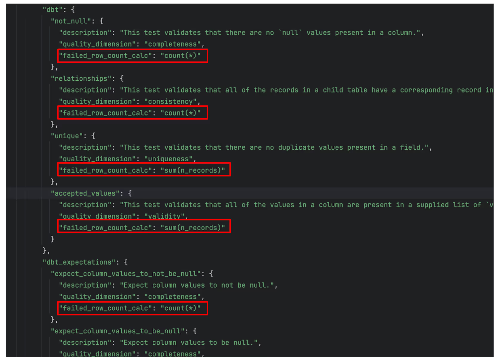
A screenshot of code displaying multiple JSON-like objects. Each contains fields for description, quality_dimension, and failed_row_count_calc, with highlights around "failed_row_count_cal" expressions.
  • Enriching the Elementary Artifact Table: The test results stored in Elementary’s artifact table include:
    • Aggregated failure counts (as returned by dbt).
    • The precise number of failed rows, enabling more accurate calculation of quality dimensions.

Integration and Usability

Elementary seamlessly integrates with dbt’s natural workflow, ensuring that the enhanced data health calculations are fully compatible with existing pipelines. Users can access this enriched data through Elementary’s dashboards and leverage it to derive precise and actionable insights.

By combining automated test mapping and accurate calculation of the actual number of failed row count, Elementary makes it easier to calculate accurate, actionable data health scores in the dbt ecosystem.

The Data Health Dashboard

The Data Health Dashboard is a powerful tool designed to provide comprehensive insights into the quality of your data. It calculates and visualizes:

  • Total Health Scores: An overall score representing the health of your data assets.
  • Quality Dimension Scores: Individual scores for key dimensions, including completeness, uniqueness, freshness, validity, accuracy, and consistency.

Here are some of the key features:

Coverage Gap Identification

If no tests are detected for a specific quality dimension, the dashboard highlights this as a coverage gap and recommends adding tests to gain visibility into that dimension.
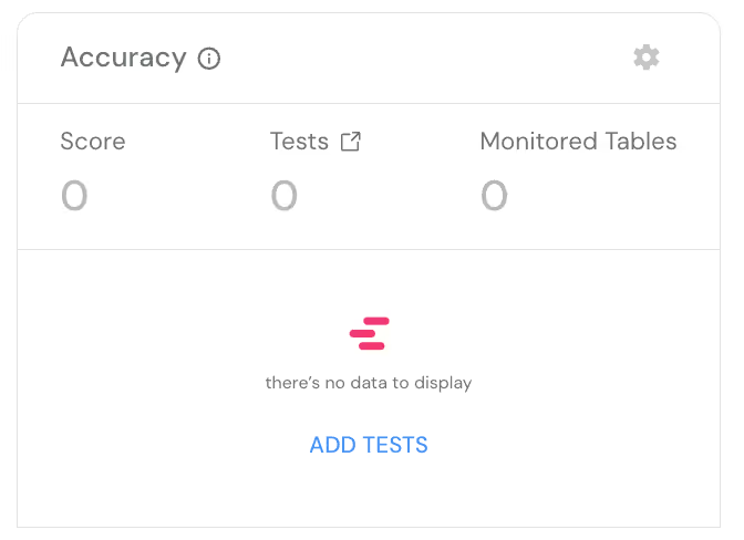
A dashboard displaying accuracy metrics. Scores, tests, and monitored tables all show zero. Text indicates theres no data to display. A button labeled ADD TESTS is at the bottom.

Quality Dimension Mappings

From the quality dimension scores, users can navigate directly into test results to investigate and understand how specific test outcomes contribute to the overall and dimension-level health scores.

A dedicated column in the dashboard displays the mapping of different dbt tests into corresponding quality dimensions, making it easy to track and manage test coverage.
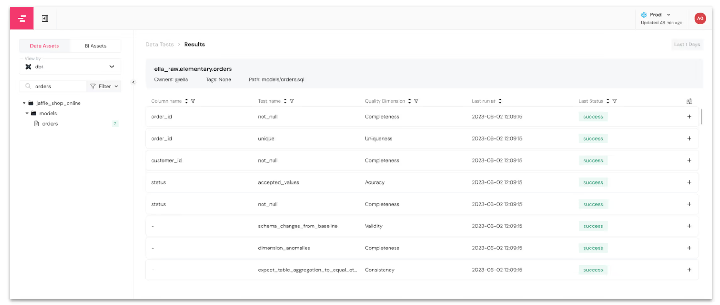
Screenshot of a data analysis dashboard showing data test results. It lists data tests like not_null and accepted_values, with their respective quality dimensions such as Completeness and Accuracy. The table also shows run times, column name, and last status.

Native and External Catalog Integration

Elementary Cloud’s Native Catalog: An enriched alternative to dbt docs, featuring all Elementary test results, monitors, and quality dimension scores.
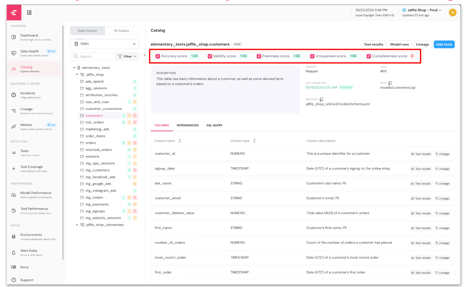
Screenshot of a data dashboard showing a catalog with a list of columns and their details, such as column name, description, and column types. The highlighted top section displays scores for accuracy, validity, freshness, uniqueness, and completeness.

Integration with External Catalogs: Elementary integrates with tools like Atlan, embedding quality scores (overall and per dimension) into external catalog assets. This ensures data analysts can assess data trustworthiness directly in their workflow.
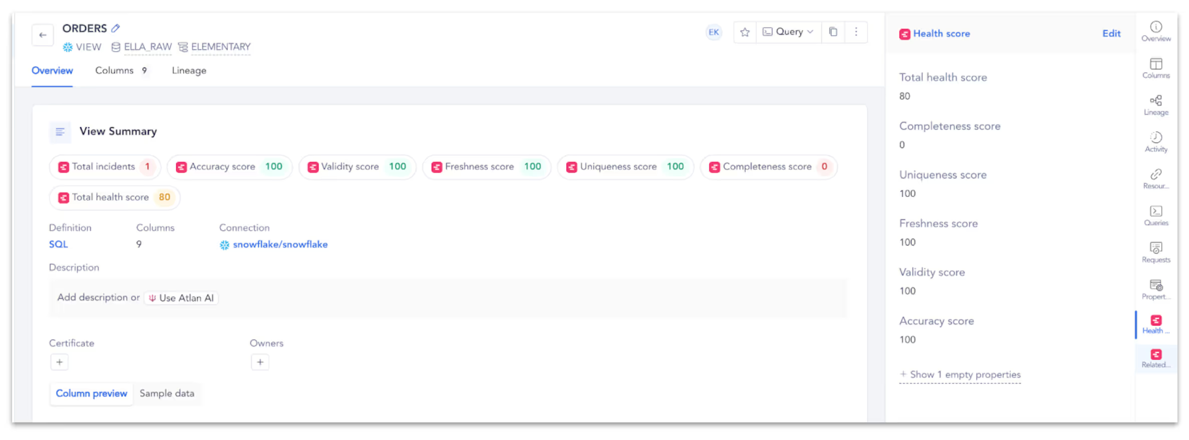
A dashboard displays an overview of data metrics for an “ORDERS” view. It shows a health score of 80, with detailed scores for accuracy, validity, freshness, and completeness.

BI Tool Enrichment (Coming Soon)

Quality dimension scores will soon integrate with popular BI tools, allowing analysts to include these metrics in dashboards, empowering end-users to trust the data they consume.

Alerts and Anomalies

  • Alerts notify users of drops or anomalies in quality dimension scores.
  • Summaries provide an overview of recent quality scores for data domains and products.
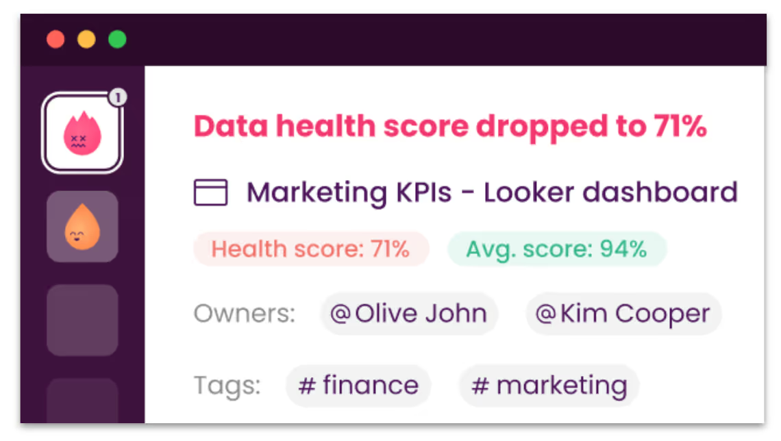
A Slack or Teams message showing a data health score drop to 71%. The marketing KPIs and Looker dashboard are mentioned. Health score is 71%, average score is 94%. Owners are @Olive John and @Kim Cooper. Tags include #finance and #marketing.

Domain-Level Insights

Users can assign tags to monitored data assets to group them by business domains (e.g., "sales"). The dashboard provides domain-specific insights, helping teams understand the quality status of critical data assets.

Customizable Thresholds and Weights

Configure thresholds for both total and dimension-level scores to classify data health as "fine," "warning," or "critical."
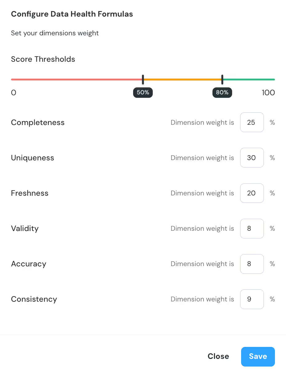
A data health configuration form shows a score threshold slider from 0 to 100, marked at 50% and 80%. Dimensions listed are Completeness (25%), Uniqueness (30%), Freshness (20%), Validity (8%), Accuracy (8%), and Consistency (9%). A Save button is visible.

Assign weights to quality dimensions to customize the calculation of the total health score based on organizational priorities.

A completeness score threshold bar ranges from 0 to 100. Red, orange, and green sections represent different completeness levels. Indicators at 41% and 70% mark transitions. Close and Save buttons are at the bottom right.

Trends Over Time

The dashboard tracks historical trends for both the total health score and individual quality dimensions, helping teams monitor improvements or emerging issues over time.

A dashboard showing a 71% total health score labeled as medium, with 53 total tests conducted. A line graph on the right displays the health scores slight decline over time from 10/28 to 11/4.

Start Measuring Data Health

Measuring data health is no longer optional—it’s essential for building trust in data. By adopting frameworks like quality dimensions and leveraging tools like Elementary, teams can move beyond ad hoc testing to a structured, transparent approach to data quality.

Start your journey with Elementary’s open-source tool or explore the comprehensive capabilities of Elementary Cloud.

Contributors

No items found.